Thursday 24 March 2011

Dojo


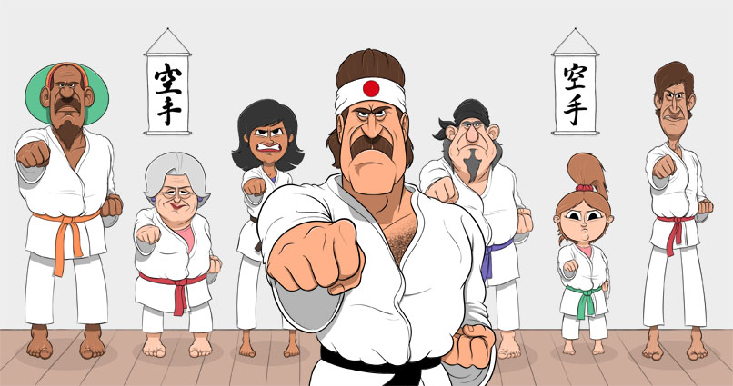
This is a new peace of work for my portfolio. It's the first finished illustration I've done in a long time and there are things about it I think I could improve but all in all I'm relatively pleased. I got the Japanese scroll type from the Internet and I have no idea what it says. It could say "half price sale" and I'd be none the wiser, although it fits in well with the idea that instructor is a little ridiculous and knows nothing of Japanese language or culture and just uses it to enhance his martial arts image. The instructor himself is modelled heavily on a Jim Carrey's karate instructor. I haven't got around to putting the club logo on the instructor's jacket but it will be called "Chuck Marmalade's Karate school". I had originally planned to put some slogans on the wall as well like "punch fear in the teeth" but I thought it'd look cluttered.

Monday 21 March 2011

Inigo Montoya


A quick Photoshop doodle of Inigo Montoya from the The Princess Bride. Ok, fine it looks more like Captain Hook but there are significant similarities between the two characters.

"Hello, my name is Inigo Montoya. You killed my father. Prepare to die". Class!

Tuesday 15 March 2011

Franky


I had planned to do a weekly blog and the excuse I was going to use for missing last week was that work came in a I didn't have time. There are guys and girls out there in the art world with immense work loads who still manage to keep on top of their blogs. I just forgot. I admit it!

So a week late I wanted to talk about colour. I was never really bothered much about colour when I was a student which sounds like madness as I'm an illustrator. The drawing was the most important aspect for me. However, while reading a article on colour theory I was struck by how ignorant I was. As part of the new direction which I will mention in a moment I thought it would be a great opportunity to improve on some of the basics that all illustrators should have. I.e. An understanding of colour. The above image of Franky is a monochromatic colour scheme, which is differing tints, shades and tones of the same hue. I'm sure you already knew that but to my great shame I didn't.

I have one last thing to say regarding the for mentioned new direction that was talked about in my last post. I fell straight back into old habits and it's only after sketching out the above doodle that I thought "I'm really having fun" and that was followed by "I wish I was having this much fun updating my portfolio". I was yet again working on designs I thought other people would like rather than the stuff I like. Why can't I have this much fun producing portfolio pieces? Why indeed. I suppose old habits die hard as they say.

Doodle was inked and coloured in Photoshop.

Thursday 3 March 2011

A fresh start.


I took some time out from illustration for reasons I won't bore you with, and over this period I had time to look at my career to date and think about it in more detail than I had when I was concerning myself with the next job or getting the next job. I realised that I took no real pleasure in illustration and that my most enjoyable experiences were when I doodled in my sketch book. Why? I think because I always tried to do work which I thought people would like and commission rather than producing work which I enjoyed doing. Where as in my sketch book I could draw anything I fancied drawing without any constraints or expectations. I hope to change my attitude toward my career and work. Above is a Photoshop doodle I did today.